
Operating System
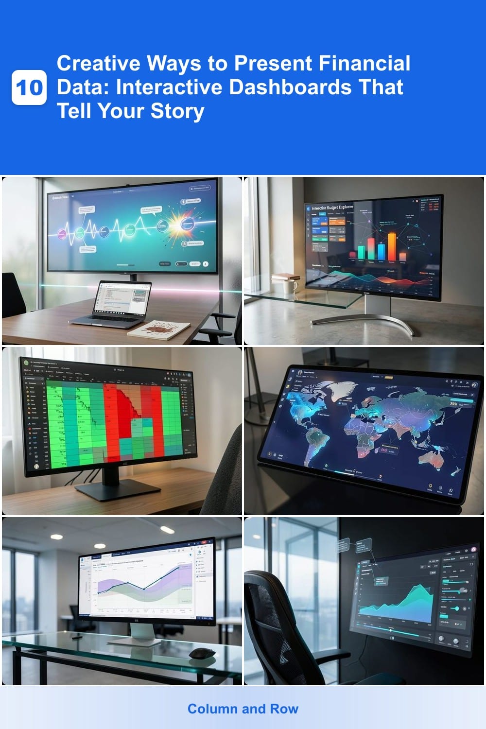
Transforming dry numbers into compelling stories is key to effective financial communication. These 10 interactive dashboard techniques help you visualize data in ways that engage stakeholders, simplify complex insights, and drive better decision-making—without requiring advanced coding skills.
Animated Storytelling Timeline for Financial Growth

Tired of static spreadsheets that make financial growth feel like a boring history lesson? An animated storytelling timeline turns your company’s journey into an immersive narrative—perfect for startups pitching investors or teams tracking progress over time.
Tools like TimelineJS (free and open-source) or PowerPoint’s Morph transition let you map milestones, funding rounds, and revenue spikes onto a visual timeline. Hover over key points to reveal details like investor names, funding amounts, or revenue figures—no coding required. The animation smooths transitions between years, while color-coded markers highlight growth spikes or setbacks.
Investors and founders love this approach because it’s far more memorable than a spreadsheet. Start with a free tool like TimelineJS to prototype, then refine with Canva’s animated charts for a polished pitch-ready design. ✨
Interactive Budget Explorer with Drill-Down Filters
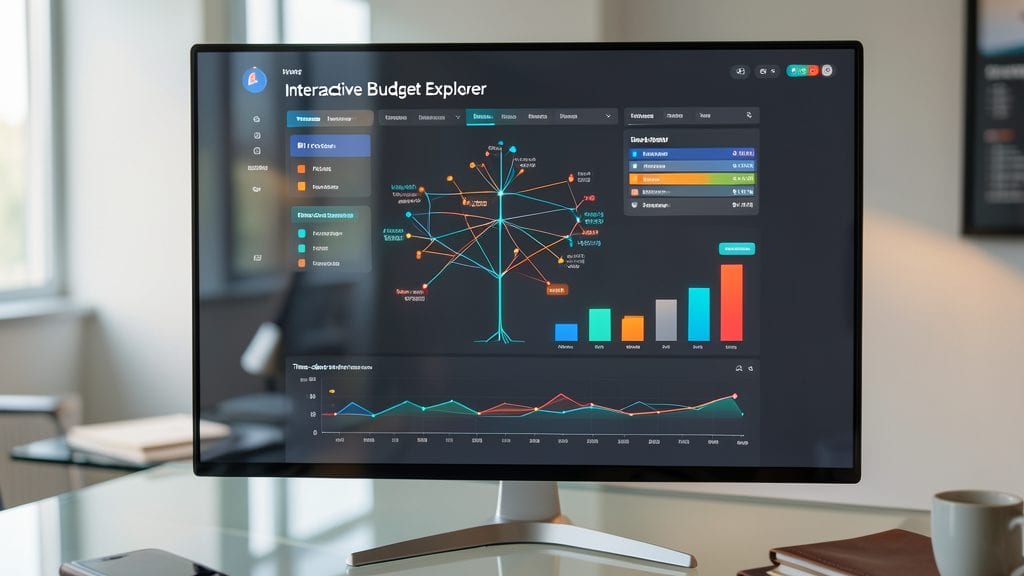
Tired of static spreadsheets that bury key insights under layers of data? The Interactive Budget Explorer turns your financial reports into a dynamic playground where every stakeholder can uncover trends exactly how they need them.
With real-time drill-down filters, users can slice spending data by department, quarter, or category—all while seeing updates instantly. Customizable views let CFOs focus on high-level trends, while managers dive into granular details. Tools like Power BI or Tableau make this setup surprisingly easy, even for non-developers.
Perfect for finance teams juggling multiple priorities, this approach ensures everyone—from executives to department heads—sees exactly what matters to them. 💡
Real-Time Stock Portfolio Heatmap Visualization
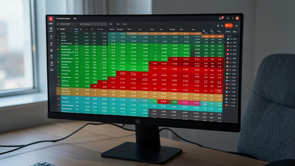
Tired of poring over spreadsheets to track your stock portfolio? A real-time heatmap visualization transforms your investments into an intuitive, color-coded grid where gains glow green and losses flash red—all at a glance.
Tools like TradingView or Portfolio Visualizer let you overlay sector comparisons, risk heatmaps, and even volatility indicators onto a single interactive dashboard. Hover over any cell to see exact percentages, and toggle between timeframes (daily, weekly, or YTD) to spot trends instantly. The drag-and-drop rebalancing feature in some platforms even lets you simulate trades before committing real funds.
This approach is a game-changer for active traders, retirement planners, or anyone juggling multiple assets. Whether you’re adjusting your ETF allocations or spotting a sector dip early, the visual clarity cuts decision-making time in half. ✨
Geospatial Revenue Distribution Maps
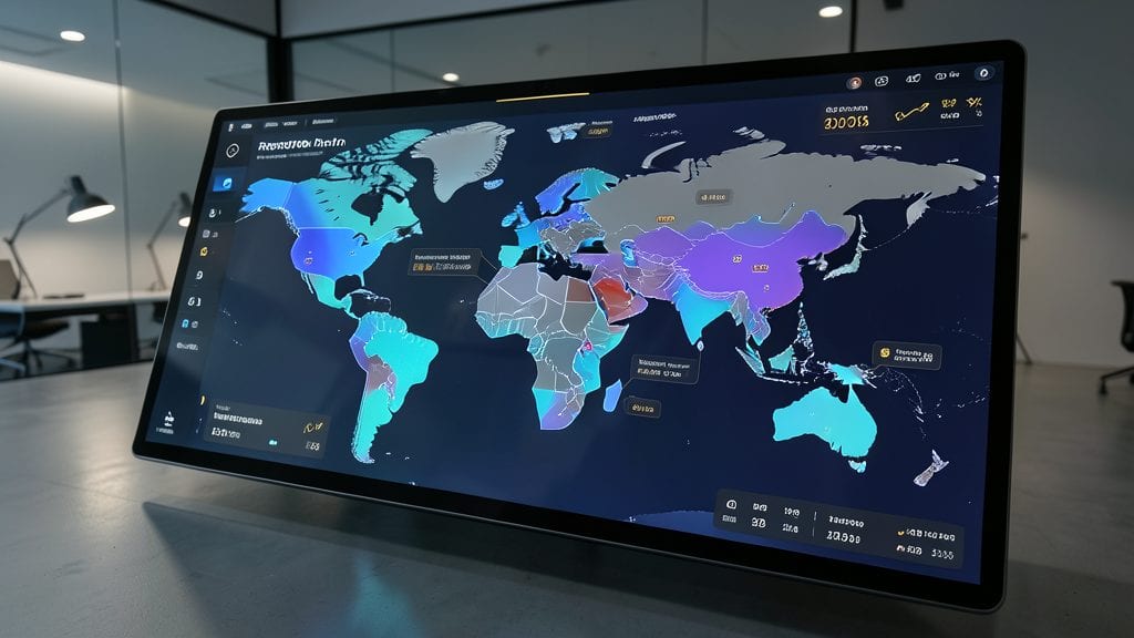
Turn global sales data into a strategic advantage with geospatial revenue distribution maps—where every city, region, or country becomes a clickable data point. Unlike static spreadsheets, these maps let stakeholders instantly spot high-performing markets, identify underperforming regions, and drill down into local revenue drivers with just a hover.
Tools like Tableau, Power BI, or Google Data Studio make it easy to overlay revenue figures on interactive maps, using color gradients to highlight performance at a glance. Add custom tooltips to display exact sales figures, growth trends, or even competitor benchmarks when users click on a location. For businesses with multi-regional operations, this approach transforms abstract numbers into a tangible, actionable visual.
Perfect for retail chains, franchise owners, or global enterprises, these maps help leadership make data-driven decisions faster—whether it’s reallocating resources or celebrating regional wins. 🌟
Predictive Forecasting with Confidence Intervals
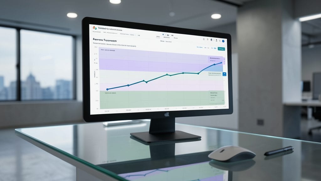
Tired of presenting revenue forecasts as rigid, one-dimensional lines? Predictive forecasting with confidence intervals transforms guesswork into actionable insights by wrapping projections in shaded bands that show potential outcomes—from best-case to worst-case scenarios.
Tools like Tableau or Power BI let you overlay statistical confidence ranges (e.g., 80% or 95%) onto your forecasts, turning abstract numbers into visually intuitive risk assessments. For example, a blue-shaded band around your revenue line instantly communicates that while you expect $5M, there’s a 70% chance it’ll land between $4.5M and $5.5M. This clarity helps stakeholders weigh opportunities against risks without diving into spreadsheets. ✨
This approach is a game-changer for CFOs and board members who need to justify decisions under uncertainty. Whether you’re pitching investors or aligning internal teams, confidence intervals replace vague optimism with data-backed storytelling. 💡
Comparative Benchmarking with Custom Peer Groups
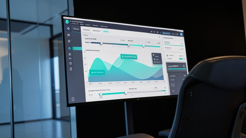
Tired of generic industry comparisons that don’t reflect your company’s unique position? Comparative benchmarking with custom peer groups lets you build dynamic dashboards where you define the competition—no pre-set KPIs required.
Use interactive sliders to adjust metrics like market cap (500M–5B range), revenue growth (0–50% YoY), or profit margins (5–30%) in real time. Tools like Tableau or Power BI let you overlay side-by-side bar charts with company logos as clickable elements, while gold/silver/bronze ranking bands highlight performance tiers instantly. The result? A self-service analysis where stakeholders drag sliders to see how your company stacks up against peers on their terms.
This approach is a game-changer for investor decks, board presentations, or competitive strategy sessions—especially when you need to justify positioning against non-obvious peers. 💡
Interactive Cash Flow Waterfall Chart

Turn abstract cash flow discussions into crystal-clear visuals with an interactive waterfall chart—the ultimate tool for breaking down inflows, outflows, and net changes in real time. Unlike static spreadsheets, this dynamic format lets stakeholders hover over bars to reveal exact figures, see cumulative totals instantly, and even toggle between operating, investing, and financing activities with a click.
Tools like Power BI or Tableau make it easy to build these charts with drag-and-drop precision, while Excel’s built-in waterfall charts (with conditional formatting) offer a zero-config starting point. The key feature? Color-coded segments—green for positive cash flow, red for outflows—so even non-financial teams grasp the story at a glance. Add tooltips for deeper dives into categories like "salaries" or "capital expenditures," and you’ve got a presentation that’s both engaging and precise.
This is your go-to for quarterly reviews, investor meetings, or operational deep dives—any scenario where explaining cash flow movements feels like herding cats. 💡
AI-Powered Anomaly Detection Dashboard

When every dollar discrepancy could signal fraud, an AI-Powered Anomaly Detection Dashboard turns raw transaction data into actionable insights. Unlike static reports, this tool automatically learns normal spending patterns and flags suspicious activity—like sudden vendor price spikes or duplicate payments—with real-time alerts and explanations.
The dashboard uses unsupervised machine learning to detect outliers, then presents them visually with color-coded severity levels (red for high risk, yellow for review). You get customizable thresholds for false positives and integration with tools like QuickBooks or ERP systems. For example, it might highlight a $12,000 payment to a new vendor with no prior history, complete with a risk score and suggested next steps.
Perfect for finance teams or small business owners who need proactive fraud prevention without hiring data scientists. The visual alerts make it easy to explain findings to non-technical stakeholders, turning data into a security tool. ✨
Interactive Scenario Planning Wheel
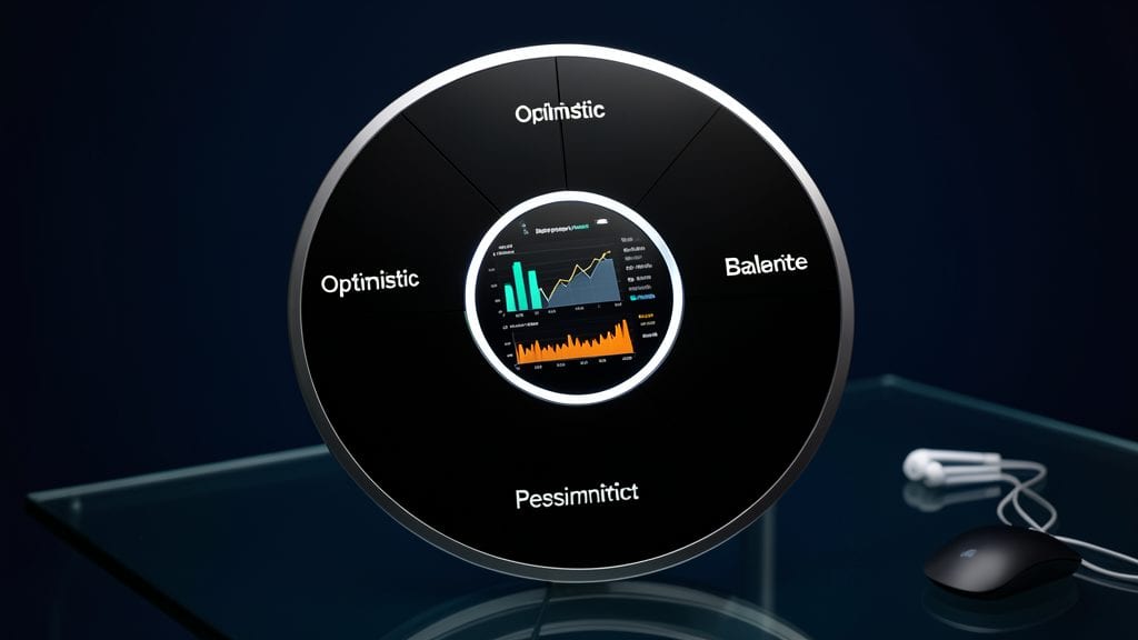
When uncertainty looms, a scenario planning wheel turns "what-if" questions into actionable insights. This dynamic tool lets stakeholders rotate through optimistic, baseline, and pessimistic economic models with a single click, instantly updating revenue projections, cost structures, and cash flow forecasts.
The wheel’s real-time impact visualization highlights how variables like inflation rates or supply chain disruptions ripple across your financials. Tools like Tableau or Power BI make it easy to embed this interactive element in presentations, while customizable color-coding ensures even non-financial teams grasp the implications at a glance.
Perfect for board meetings or investor updates, this approach demystifies complex trade-offs and aligns everyone on risk tolerance. ⚡
Personalized Executive Summary Cards

Tired of scrolling through bloated reports just to find the one metric that matters to you? Personalized Executive Summary Cards solve this by dynamically displaying only the KPIs relevant to each user’s role—whether it’s revenue growth for sales leaders or burn rate for CFOs—based on their login credentials.
These cards use role-based filtering to auto-populate dashboards with pre-configured metrics (e.g., customer acquisition cost for marketing, operational efficiency for ops teams). Tools like Power BI or Tableau can integrate with your HR system to assign roles, while platforms like Domo or Looker offer drag-and-drop customization for non-technical users. The result? A single-pane view that cuts meeting prep time by 70%—no more digging through irrelevant data.
Perfect for executives who value speed over spreadsheets, these cards shine in quarterly reviews or board meetings, where every second counts. 💪